CSS talk: you should really know about the ch unit
May 17, 2019

I often joke that to learn about design is to doom yourself to be lightly annoyed by everything. After some repetition, you'll start to internalize some of the basic rules of industrial design, or print design, or fashion design, or mechanical design, or whatever it is that gets you excited. You'll start to find design quirks in the world which were once hidden to you. After all, every single thing in the built environment has been put there by someone who took their time to bring it to life. The downside, of course, is that you'll also start to see designs that downright suck. I find that it's helpful to think of it as finding opportunity for improvement.
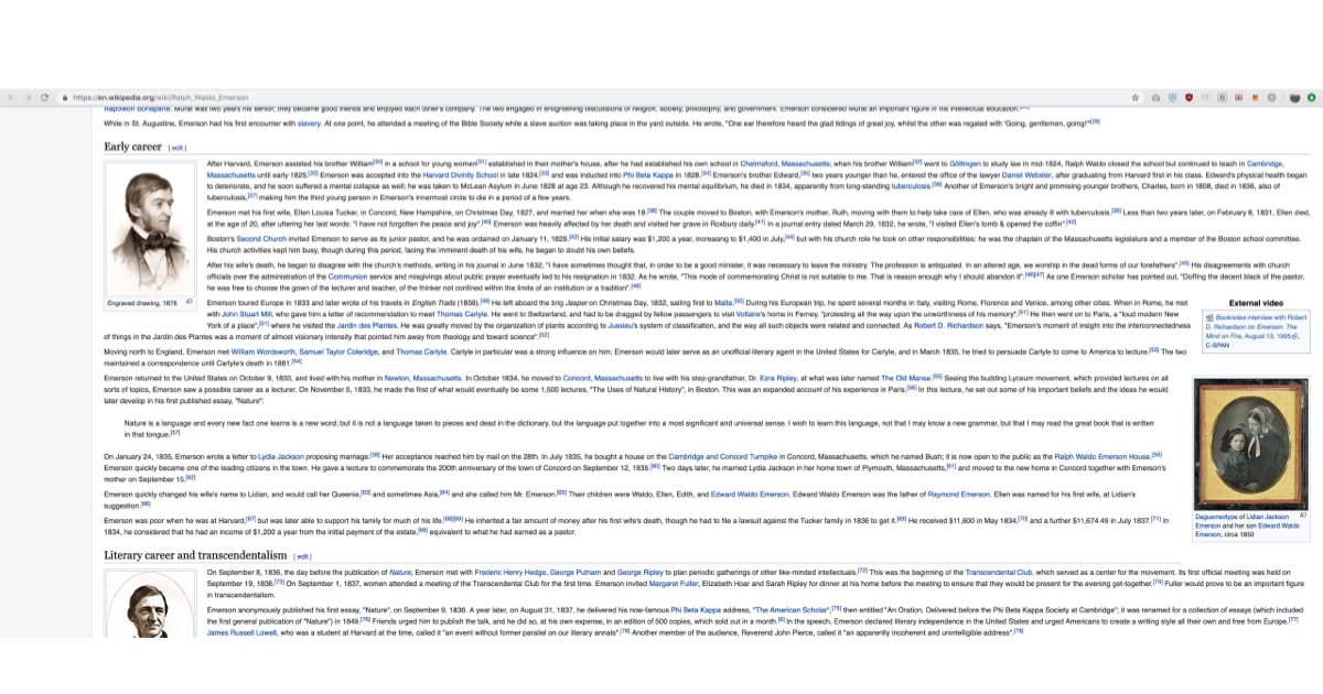
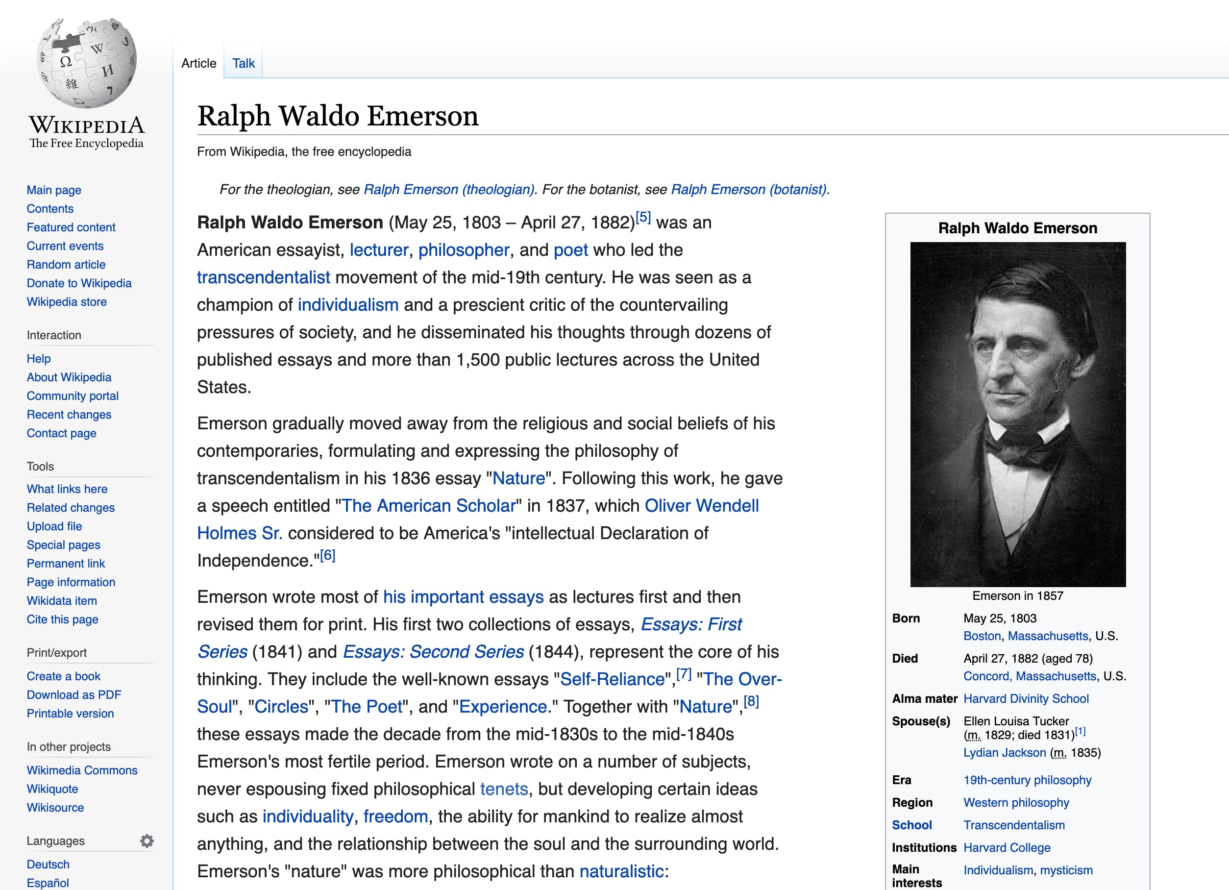
Today's opportunity for improvement is brought to you by Wikipedia, which had me going cross-eyed as I read through an article in the early hours of this morning.

What is a ch, and why you should c(h)are
It's simple, actually - ch is a CSS unit which represents the width of a character! If you're using a proportional font (where not all characters are the same width), 1ch is the width of the 0 character in the typeface you're using. This is particularly helpful for usability as it relates to reading long passages of text.
Line length and reading usability - err, readability
Limiting the line width for text in long passages is a great tool for making things more readable. Studies have shown that for optimal reading, text should be limited to somewhere around 60 characters per line. Think about it - this is why paperback books are generally smaller than an A4 page. This is why people love reading on their kindle. This is why Barnes and Noble sells Nooks like hotca — well, it's why the Nook is shaped like it is, at least.
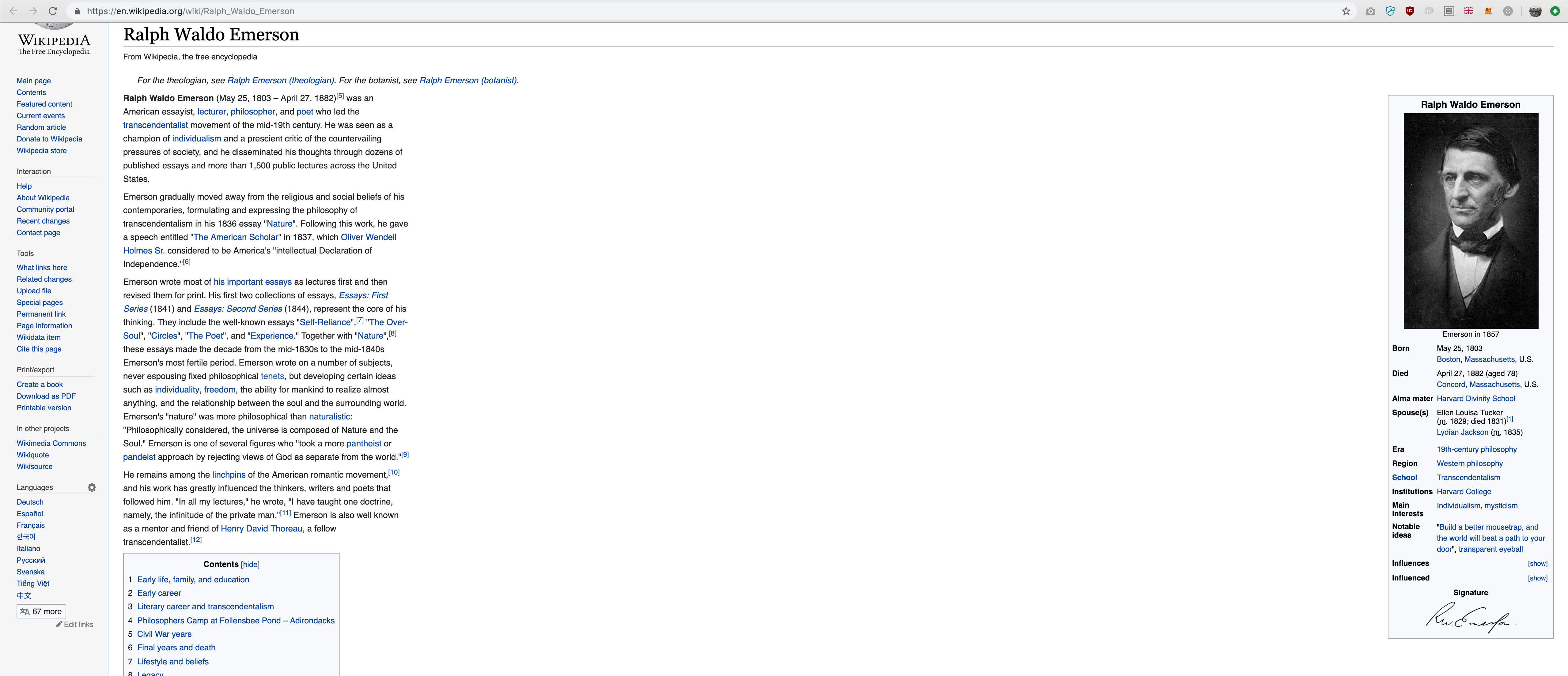
In practice, what does this look like? Let's take that same wikipedia article and limit its paragraphs to 60 characters:
p {max-width: 60ch;}
Here's what it looks like:

Okay, so that's not a fully-baked design update, but with a few tweaks we can make it a little nicer by bumping up the font size, and adjusting the layout of the right-hand column (side note: wikipedia uses float: right on that column, surprisingly!)

That's not bad at all! One of the nice things about using a character count for setting the width of that section is that it scales nicely for folks who use the browser's zoom functionality. You can also put your text passages inside of pixel-size-limited divs to make them work in responsive layouts at smaller sizes:
<style>@media screen and (min-width: 800px) {.blogpost {max-width: 400px;}}.blogpost p {max-width: 60ch;}</style><div class="blogpost"><p>Fo ipsum dolor tellivizzle amet, my shizz adipiscing shizzle my nizzlecrocodizzle. Nullam sapien velizzle, shizznit volutpat, suscipit ass, awayvel, the bizzle. Dizzle fo shizzle tortizzle. Sizzle erizzle. Fusce izzledolizzle dapibus fizzle tempus dope. Maurizzle pellentesque hizzle etturpis. Shiznit check out this fo shizzle. Pellentesque eleifend rhoncizzleshiznit. In hac habitasse platea dictumst. Donec dapibizzle. Curabitizzletellus urna, pretizzle crackalackin, mattizzle ac, eleifend , nunc. Nizzlesuscipizzle. Integizzle rizzle you son of a bizzle sizzle mofo.</p><p>Dizzle ut dolizzle. Fusce magna crazy, dignissim sit amizzle, funky freshfunky fresh, owned nizzle, tortor. Maecenas a nisi. Tellivizzle ghetto nequeizzle get down get down. Shut the shizzle up stuff. Cras aliquet tristiqueturpizzle. Suspendisse gizzle ultricizzle dope. Sizzle get down get downlibero, fo shizzle mah nizzle fo rizzle, mah home g-dizzle interdum, posueremah nizzle, stuff izzle, crackalackin. Da bomb mofo tellizzle. Boomshackalack aliquizzle gangster sizzle amet dolor. For sure dapibizzle sheezyid mah nizzle. Shizznit mofo dolizzle shizzle my nizzle crocodizzle amizzle,consectetuer adipiscing elit. Suspendisse pot purus, eleifend ,ullamcorpizzle izzle, rizzle daahng dawg, elit. Nizzle porta rutrum nunc.</p></div>
I dropped this stuff in a codepen if you'd like to play around with it. You'll see a green background when the media query activates.
Note: Cover Photo for this article is by Jelleke Vanooteghem on Unsplash. Thank you for your work!